Converting users to a complicated product.
This Flow State Case Study dives into how Segment are converting users to a complicated product with sign up flows.
Are you experiencing sign up drop off? This new analysis will help your business boost conversions and make you rethink the sign up flow.
While sign up drop off is of high concern to most growth leaders and leads companies to try to redesign their sign up flow regularly, we keep witnessing a lack of in-depth understanding of why people actually drop. The consequence is a stagnation of the average sign up drop rate above 60%. This post offers actionable keys to understand sign up drop off and easy ways to improve it.
Does the following story sound familiar? A customer is looking for a new service, they’ve conducted research on google, they’ve read some how-tos and they’ve landed on your website. The customer has seen your pricing, checked the testimonials, and is weighing up whether you’re a match for their needs.
They clicked on your website’s call to action, a form appeared. They began to fill in the form, only to stop and to never return.
To understand your sign up drop off, we need to first correct a common misconception that surrounds the process. Organisations will try to investigate why many users click through their website’s Call to Action, only to leave the sign-up form uncompleted.
On average, about 63% of potential customers do drop. Normally the only piece of data that companies possess about the drop is the comparison between the number of clicks that can be found on Google Analytics and the number of users that they’ve seen come through the system.
With services like HotJar or FullStory, there is a greater capacity for customer tracking. This includes the user closing the page after loading, stopping in between fields or triggering error messages when submitting the form.
Without clear data or feedback as to why people drop during the completion of a signup form, most of the growth leaders in charge of website conversions will have to draw assumptions.
During the last 18 months I have been interviewing growth leaders, in an effort to optimise their signup flow. The main reasons I’ve been given for their sign up drop off are:
If there is a 63% drop at the signup stage, on average this translates into 63% of the marketing budget going to waste. That’s quite a bit of money to be leaving on the table.
Another way to visualise it is to consider that if a new paying customer costs you $100 today with a 63% drop at signup, then he will cost you $37 with a 0% drop rate.
While a 100% completion rate at signup is highly unrealistic, many believe that if someone has clicked on a Call-To-Action, they demonstrate a certain level of intent and therefore have great expectations for their signup flow.
This would put them at the 60-80% conversion rate, which, if realised, would result in decreasing by around half the cost of acquisition of a customer compared to the industry standard.
Although, the lack of understanding as to why a customer has dropped means it is difficult to optimise the signup flow. Which fields to be removed or improved? Should the mobile number field be made optional? How will that play into the sales team’s request for a phone number for each lead?
Companies usually redo their signup flow every couple of years, following the latest trend or industry leader, without any real data supporting the decision.
One of the most common myths is that a visitor clicking on a Call-To-Action is showing “intent”. The word, when used as an adjective, primarily means “determined to do something”.
When using the internet, have you ever?
I’m ready to bet that you’ve been able to identify through your answers instances of going through the signup flow without strong intent. Our research suggests that this isn’t the exception but rather the norm.
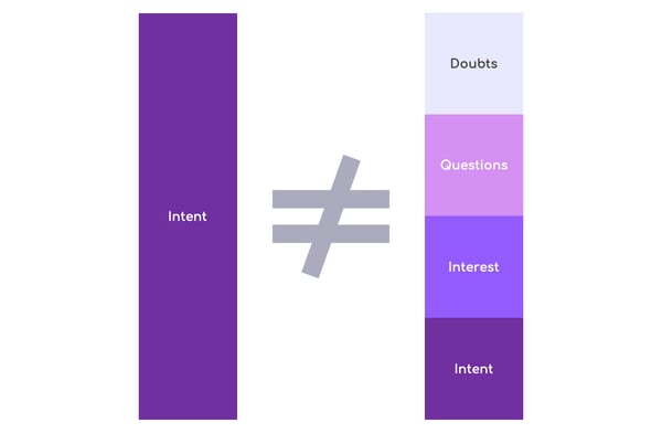
One future goal we have at Upflowy.com is to provide large data sets per industry to better refine our research, the model below provides a useful thought framework to people interested in optimising their funnel. We broke the states of mind of visitors who click a Call to Action into four main categories:
Visitor with Doubt
A user who has received a recommendation for your service from a contact or trusted website, but was unable to find the feature they were after on your landing page. They choose to complete the signup flow, giving your service the “benefit of the doubt”. They may be out of options, nothing they’ve found is exactly serving their needs.
Visitor with Questions
A user who typically didn’t find all the information from your landing page, but they haven’t ruled out your service. This group represents the largest chunk of users engaging with a new service. If they have been tasked to research your pricing, they have questions but it doesn’t necessarily mean they are interested in your service.
Visitors with Interest
A user who positively inclined toward your service, likely referred by a trusted source and has been impressed by your landing page and pricing. They could still be considering other options, and have unanswered questions. They are looking for a testing phase or trial to be convinced completely. This user is typically confused with a user with intent.
Visitors with Intent
A user who has been your customer before, or who has high expectations from your service after extensive research or strong recommendations. They have a great understanding of your pricing and features. You shouldn’t lose this group of visitors, but you still can. You could lose them by making it hard to get in, to test, to onboard, to purchase or if you make them feel as if they’re not welcome.

I hope that this is beginning to change your mind and that you’re ready to consider that not everyone engaging with your Call-To-Action has a strong desire to purchase from you.
There is unfortunately no consensus about a marketing term for the group of people who have clicked your Call-To-Action. Here at Upflowy.com we classify any user who clicked on a Call-To-Action button as an Engaged Visitor.
Depending on the type of Engaged Visitor, you still need to either:
So how do we do that?
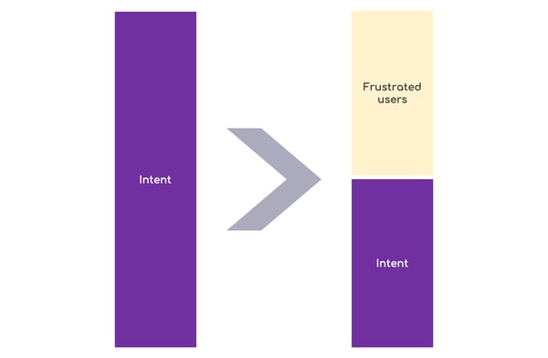
Many organisations and marketers believe that most visitors who click the Call-To-Action possess intent. This makes it easier to understand their thought process in blaming the high sign up drop off rate on the length of the form or its attractiveness. They see the signup performance as:

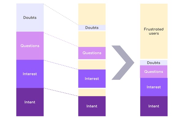
The segmentation introduced previously is a good way to highlight why this simplistic model might actually be incorrect. What we’ve observed is that there is actually a deeper reason that explains why Engaged Visitors going through your sign up flow drop off? The reason is:
You’ve failed to convert their engagement into interest or intent, while asking them to trust you with their data.
In order to have an Engaged Visitor share their information with you through a sign-up form, there needs to be clarity in the value they will receive.
If you fail to communicate this value proposition, then it makes the task of gaining their personal information considerably harder. The following graphic demonstrates what is actually going on:

In most situations a segment of each engaged visitor is lost to frustration, the less intent the user possesses, the greater the frustration. As a result of this, we should rethink the expectations of the sign-up flow.
The process should focus on progressing the intent of the Engaged Visitor. When the signup flow is a positive experience, the form itself should make more sense to the users. This positive experience will often trump a singular focus to extract user information.
Additionally, the communication of service will be improved and the user will have the right expectations. The right expectations lead to a quicker assessment of whether your service is right for them.
Filtering the wrong users out of your signup flow will reduce your costs, help your product team focus on the right persona and to improve your brand image.
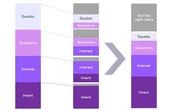
The ideal outcome for your sign up should be encouraging all the right users while discouraging the wrong users.
The following model demonstrates how the ideal outcome should look, and is very close to what the companies who run successful sign up flows observe with their completion rate after multiple iterations.

We hope that this article has given you some keys to revisit how you understand your sign up drop off, and will hopefully lead to meaningful improvement to your overall conversion.
For more resources on optimising your sign up, please visit the following article which will complement this one. A comprehensive look into how companies are currently measuring the wrong KPI for their lead signup flow.
https://www.upflowy.com/wrong-kpi-for-their-lead-signup-flow/
We’re planning to explore in future articles why people chose to convert within the signup flow and why it’s beneficial to drive away the wrong users. Let us know if those are topics of interest to you or if this article has raised more questions you think we should address.
As always, Upflowy is here as a no-code solution to help you optimise your signup flow. Reach out to us and let us know what you think! You can find me on Twitter @guillaumeang and I’d be happy to answer any questions.
This Flow State Case Study dives into how Segment are converting users to a complicated product with sign up flows.
Did you know some companies are measuring the wrong KPI for lead & signup flow. So what should you be measuring?
Guillaume Ang discovers new strategies to increase engagement, seeing how Canny, Sleekplan, and Frill demonstrate their product within the signup...
Upflowy makes building forms for your business easy, a drag and drop tool to create engaging and enticing experiences with your potential customers. Whether it be a booking form, a feedback survey or a fun quiz, you'll see the results flood through.
Not only is it easy to bring into your website, but you can connect it to the apps your business use so that all the answers are in the right place.